

Gaming
Essential guidelines for effective game UI design in 2025
Essential guidelines for effective game UI design in 2025: foundations that drive retention and flow
Effective game UI in 2025 blends usability, immersion, and performance into a seamless whole. Unlike web or app interfaces, the interface must amplify the play experience and never compete with it. Industry research consistently shows that unclear HUDs and confusing menus push a large portion of players to churn within their first session, putting retention and revenue at risk.
The most reliable antidote is a layered information model. Critical elements such as health, ammo, cooldowns, and objectives remain visible or context-aware, while tactical details sit one interaction away, and deep systems live inside menus. This hierarchy respects cognitive load during intense moments and keeps the SmoothInterface principle front and center. Teams that operate like UIFlowMasters validate this architecture with playtests, eye-tracking, and analytics funnels, then iterate relentlessly.
A practical playbook relies on adapted usability heuristics. Visibility of state, match to real-world metaphors, consistent patterns, recognition over recall, and clear error recovery translate well to interactive entertainment. To accelerate discovery, product teams often build quick paper flows and thumbnail sketches; techniques like the ones in thumbnail sketching help condense many ideas into a few testable options before production art begins.
Applying heuristics without breaking immersion
Designers can signal damage through multi-channel feedback—bar changes, vignette edges, haptics, and audio—so the message cuts through chaos. Recognition beats recall, so expose available actions visually and surface tooltips or previews on hover or focus. When players hit friction, write human error messages and provide an obvious path forward; if your online game surfaces service faults, a reference like common error code patterns can inspire simple, player-first phrasing.
To keep the craft current, teams study trend roundups and platform talks. A great way to see working patterns is to explore tutorials and conference recaps; for example, creators frequently combine AI-supported testing with rapid HUD iteration, drawing inspiration from AI video ideation tools to communicate design intent quickly to stakeholders.
- 🎯 Prioritize primary gameplay data and fade non-essentials during exploration.
- 🧭 Use familiar metaphors and icons so players instantly “get it.”
- ⚡ Provide fast recovery from mistakes with undo/cancel everywhere possible.
- 🧪 Validate with 5–8-person playtests per iteration to catch most issues early.
- 🤝 Cross-check designs with GameUXPro, UIEssentials, and PixelPlayDesign heuristics.
| Heuristic 🧩 | Implementation for games 🎮 | Example insight 💡 |
|---|---|---|
| Visibility of state | Contextual HUD elements for health/abilities | Damage + haptics + vignette = faster recognition ✅ |
| Match to real world | Use universally understood icons/terms | Compass + quest markers reduce wayfinding friction 🧭 |
| Consistency | Uniform inputs, colors, layouts | Fewer mis-clicks and faster skill transfer 🔁 |
| Recognition not recall | Visible options, previews, tooltips | Hover/focus previews cut menu dwell time ⏱️ |
| Error recovery | Plain-language messages + undo | Players re-engage faster after slips 🧯 |
Curating heuristics for the moment-to-moment loop is what separates NextGenGameUI teams from the rest—when the interface becomes invisible, players stay in the zone.
For teams designing live-service overlays, it also helps to scan community systems like group chat coordination flows to learn how presence, status, and notifications scale without clutter.

Accessibility-first: Essential guidelines for effective game UI design in 2025 that expand your audience
Accessibility is a design multiplier. High-contrast text, scalable UI, and alternative input support increase reach while improving quality for everyone. Inclusive choices align with WCAG guidance and industry playbooks, and they consistently correlate with session length and retention gains across genres.
Teams often start with baseline features—subtitle controls, remappable inputs, and colorblind modes—then layer advanced options like screen reader support, alternative navigation, and aim assistance. These systems also protect your product across TV distances and mobile glare, ensuring a reliable PlayEaseTech experience under real-world conditions.
From baseline to advanced accessibility configurations
Baseline features include color contrast ratios around 4.5:1 for body text and scalable text up to 200%. Intermediate capabilities add difficulty modulation, UI scaling sliders, and redundancy for effects (visual + audio + haptic). Advanced suites include narration of focus changes, controller-only navigation paths, and granular customization of subtitle styles and sizes.
Accessibility does not live only in settings. It shapes core design: never use color alone to communicate status; couple hues with shape, position, and text. Validate with simulators and real players. When players encounter errors, messages should be concise, instructive, and friendly—borrowing patterns from clear technical communication helps, just as operational teams benefit from clarity in resources like system resource diagnostics for complex features.
- 🟢 Offer colorblind modes (deuteranopia, protanopia, tritanopia).
- 🔍 Provide text scaling from 100% to 200% with smart line spacing.
- 🎧 Add screen reader labels and live regions for status changes.
- 🎮 Ensure controller-only navigation with visible focus states.
- 🧩 Bundle preset profiles for quick setup and shareable configs.
| Accessibility tier ♿ | Key features 🛠️ | Player impact 📈 |
|---|---|---|
| Baseline | Remapping, subtitles, colorblind mode | Immediate comprehension boost ✅ |
| Intermediate | Difficulty, UI scaling, redundancy | Lower cognitive load under stress 💪 |
| Advanced | Screen reader, alt inputs, granular control | Broader audience reach and loyalty 🌍 |
Studios sharpening their inclusive craft often review platform talks and industry partnerships—the push toward inclusive tech leadership at events like NVIDIA GTC and the surge of AI investments tracked by leading AI company roundups show where tooling and standards are heading. On the practical side, voice comms accessibility can benefit from simplified set-ups similar to those highlighted in voice chat guides.
When accessibility becomes a first-class workstream, teams behave like GameVistaDesign and InterfaceInnovate squads: they test with real players, integrate findings into their design systems, and treat inclusivity as a core product quality, not an add-on.
Platform-aware interfaces: Essential guidelines for effective game UI design in 2025 across PC, console, mobile, and VR
Winning cross-platform UI starts from the most constrained surface and scales up. PC thrives on precision and density; consoles require readability at ten feet and controller-first flow; mobile demands thumb reach and interruption resilience; VR calls for world-space panels and comfort guardrails. A single UI cannot serve all four contexts without adaptive logic.
Smart teams use anchor-based layouts, safe areas, and responsive scaling. They test on ultrawide monitors, living room TVs, budget phones, and mainstream headsets. For production readiness, many teams pair engine-native solutions with service layers; case studies like cross-platform app rollouts demonstrate how shared components and platform overrides cut cycle time without sacrificing quality.
Designing for inputs, distance, and motion
Console UI thrives on clear focus rings, larger hit targets, and wrap-around navigation. PC UI benefits from hover previews and hotkeys. Mobile UI prioritizes 44–48px touch targets, thumb zones, and graceful pause/resume. VR UI keeps content within a comfortable 30–40° of the center, prefers diegetic or world-space panels, and avoids head-locked screens that trigger discomfort.
Live-service teams regularly profile performance and memory to keep interaction latency low. When tuning visual systems at scale, it helps to follow platform events and research updates, such as AI-driven optimizations highlighted at MIT’s self-enhancing AI research. For content strategy, creators often lean on automation aids for documentation when shipping across multiple storefronts and locales.
- 📺 Console: 36pt+ important text, focus indicators, safe zones.
- 🖱️ PC: hover tooltips, hotkeys, ultrawide-aware layouts.
- 📱 Mobile: thumb-reachable controls, notch-safe layouts, battery care.
- 🕶️ VR: world-space UI, minimal head-locked elements, comfort options.
- 🔁 Build adaptive logic once; toggle footprints per platform for PlayEaseTech consistency.
| Platform 🌐 | Core constraints ⛓️ | Key UI tactics 🧭 | Perf notes 🚀 |
|---|---|---|---|
| PC | Varied aspect ratios, mouse/keyboard | Dense info, hotkeys, hover previews | Test at 1080p–4K, DPI scaling ✅ |
| Console | 10-foot readability, controller | Focus rings, large targets, wrap nav | Safe area + overscan checks 📺 |
| Mobile | Small screens, touch, notches | Thumb zones, 44–48px targets | Minimize overdraw, pool objects 📱 |
| VR | Comfort, text readability | World-space panels, diegetic UI | Avoid head-locked HUDs 🕶️ |
For additional context, observe how cloud distribution changes first-run flows—launch spotlights like Arc Raiders’ cloud debut or seasonal entries such as Diablo 4 on Game Pass reshape onboarding, entitlement, and social UI needs across devices.

Teams that thrive here work like EpicUIStudios and GameVistaDesign, building shared components and then tuning each platform to feel native instead of merely “ported.”
HUD clarity and diegetic choices: Essential guidelines for effective game UI design in 2025 that respect immersion
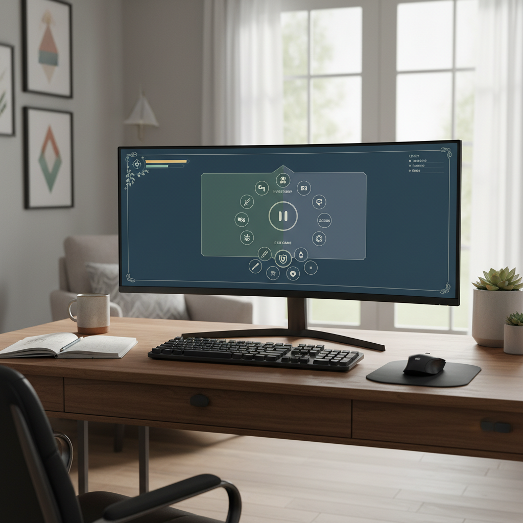
Players spend most of their attention in the 3D world, not on the HUD. The best HUDs use progressive disclosure: only show what matters, when it matters. During calm exploration, a compass, quest markers, and resource info may be visible; in combat, reduce to life-or-death stats and cooldowns, then bring back detail post-fight.
Diegetic, spatial, meta, and non-diegetic layers all have a place. Horror and survival lean into diegetic to sustain tension; competitive shooters favor non-diegetic clarity for speed. Hybrid approaches often win: non-diegetic counters for combat, diegetic kiosks and terminals for crafting or social hubs.
Contextual and adaptive HUDs driven by game state
Context-aware prompts appear only near interactables; ammo counts fade when weapons are holstered; cinematic moments temporarily suppress overlays. In adaptive systems, live gameplay metrics—threat level, resource lows, imminent cooldowns—drive dynamic emphasis so attention goes where it’s needed most.
To ensure stability at scale, analytics track where players look and what they miss. Live ops teams then tweak sizes, positions, and contrast. World-scale sandbox creators are also experimenting with synthetic playtesting, influenced by research like foundation models generating synthetic environments, to forecast UI misreads before public betas.
- 🧭 Use Gestalt grouping to cluster related elements.
- 🚨 Reserve high saturation and motion for urgent alerts only.
- 🧊 Keep overlays crisp with subtle outlines or panels over busy scenes.
- 🎯 Tune aim, damage, and cooldown signals with multi-sensory feedback.
- 🔁 Offer full HUD customization for advanced players.
| UI layer 🧱 | Best for 🏷️ | Strengths 💪 | Watch-outs ⚠️ |
|---|---|---|---|
| Diegetic | Immersive sims, horror | Atmosphere, realism ✅ | Readability under stress |
| Spatial | Open worlds, co-op | 3D awareness, clarity | Occlusion, clutter |
| Meta | Damage direction, stamina | Instinctive feedback | Overuse creates noise |
| Non-diegetic | Competitive, RTS | Fast comprehension | Immersion trade-offs |
As feature sets expand, tie the HUD to a style guide so your InterfaceInnovate and UIFlowMasters teams keep iconography, color semantics, and motion curves consistent across updates and seasons.
Menus, navigation, motion, and toolkits: Essential guidelines for effective game UI design in 2025 that scale in production
Players judge quality within seconds of opening a main menu. The strongest systems communicate structure clearly, minimize clicks to common tasks, and feel instant. Navigation should support controller-first flow, mouse hover, keyboard shortcuts, and touch gestures—without weird dead ends or hidden states.
Motion communicates relationships: slide in from the right to imply deeper levels; fade up for modals; use 100–300ms transitions for responsiveness. Layer feedback—visual, audio, haptic—so every action has a confirmation level proportional to its importance. For live teams, guides like shopping flow innovations offer models for robust in-game store UX without cognitive overload.
Choosing the right toolkit—and when to mix
Unity UGUI remains familiar for many teams and ships fast with the Asset Store, while Unity UI Toolkit brings retained-mode performance and CSS-like styling. Unreal UMG empowers designers through visual data binding and timeline animations. For web-first or hybrid surfaces, React with WebGL layers enables rapid iteration and massive component reuse. In practice, many studios embed web views for stores or social hubs while keeping engine-native HUDs for performance.
To reduce friction during prototyping, teams often produce “just enough” motion and scale rules and validate them with quick captures—short explainer clips are easy to spin up with modern editors and even AI-assisted tools like those discussed in video generator roundups. For brand-ready launch art, learn from high-signal content practices instead of getting lost in hype cycles—this is where GameUXPro and PixelPlayDesign crews save days per sprint.
- 🧭 Pick clear menu architecture (tabs, hub, tree) and stick to it.
- ⌨️ Support shortcuts and remember user state across sessions.
- 🎞️ Keep transition timings under 300ms for responsiveness.
- 🧪 Run A/B tests on placement, iconography, and copy.
- 📊 Feed analytics back to design for continuous improvement.
| Toolkit 🧰 | Strengths 💡 | Considerations 🧷 | Best fit 🎯 |
|---|---|---|---|
| Unity UGUI | Beginner-friendly, asset-rich | Manual batching/optimization | General Unity projects ✅ |
| Unity UI Toolkit | Retained mode, USS styling | Smaller ecosystem (growing) | UI-heavy, modern Unity 🚀 |
| Unreal UMG | Visual editor, data binding | Designer discipline needed | All Unreal projects 🎮 |
| React + WebGL | Component reuse, web scale | Native integration work | Web/hybrid experiences 🌐 |
Looking ahead, many teams monitor ecosystem shifts—from multi-modal comms like group chat collaboration to large-scale partnerships such as regional AI alliances—to anticipate how social UX, safety, and performance expectations will evolve across regions.
Finally, reinforce the culture of experimentation. Whether it’s a seasonal event like the spotlight on Bloodlines 2 on GeForce NOW or campaign features akin to player profiles in big shooters, UI must scale to new content quickly. That’s how NextGenGameUI teams stay nimble while shipping dependable, delightful experiences.
What color and typography rules improve readability in fast-paced scenes?
Use a restrained semantic palette with clear meanings (red=danger, green=positive, blue=information) and ensure WCAG-level contrast (around 4.5:1 for body text). Pair color with shape and labels so information is never color-only. For type, prefer highly legible sans-serifs, minimum 16pt body on PC/console and larger for TV-distance, 1.4–1.6 line spacing, and outlines or subtle panels over busy backgrounds.
How can small teams speed up UI iteration without sacrificing quality?
Sketch flows first, validate with 5–8-player tests, then build lightweight prototypes. Reuse components across screens, document colors and motion timing, and record short capture clips to share decisions. AI-aided content and quick references—like roundups of video generators—help communicate intent to stakeholders fast.
What is the safest way to make HUDs adaptive without jarring players?
Drive visibility rules off clear game states and smooth them with short, consistent animations (100–300ms). Fade in ammo only when a weapon is out, surface cooldown proximity with subtle motion or color, and suppress non-critical elements during cinematics. Offer player overrides so advanced users can lock preferred views.
Which analytics are most useful for improving game UI post-launch?
Focus on menu dwell time, backtrack paths, error frequency, heat maps for gaze zones, and funnel drop-offs in multi-step flows like crafting or purchases. Pair quantitative data with player interviews to understand why friction appears, then A/B test targeted changes for measurable gains.
Max doesn’t just talk AI—he builds with it every day. His writing is calm, structured, and deeply strategic, focusing on how LLMs like GPT-5 are transforming product workflows, decision-making, and the future of work.


Understanding the gall-peters map projection: benefits and controversies in 2025
The Reality Behind the Map: Why the Gall-Peters Projection Still Matters Every time you look at a standard world map,...


how to create a secure building link login process in 2025
Architecting a Robust Authentication Framework in the Era of AI User authentication defines the perimeter of modern digital infrastructure. In...


Top AI Tools for Small Businesses: Essential Picks for 2025
Navigating the AI Landscape: Essential Tools for Small Business Growth in 2025 The digital horizon has shifted dramatically. As we...


Choosing Between OpenAI’s ChatGPT and Falcon: The Best AI Model for 2025
The landscape of artificial intelligence has shifted dramatically as we navigate through 2026. The choice is no longer just about...


discover the most fascinating shell names and their meanings
Decoding the Hidden Data of Marine Architectures The ocean functions as a vast, decentralized archive of biological history. Within this...


Funko pop news: latest releases and exclusive drops in 2025
Major 2025 Funko Pop News and the Continuing Impact in 2026 The landscape of collecting changed drastically over the last...


who is hans walters? uncovering the story behind the name in 2025
The Enigma of Hans Walters: Analyzing the Digital Footprint in 2026 In the vast expanse of information available today, few...


Exploring microsoft building 30: a hub of innovation and technology in 2025
Redefining the Workspace: Inside the Heart of Redmond’s Tech Evolution Nestled within the greenery of the expansive Redmond campus, Microsoft...


Top AI Tools for Homework Assistance in 2025
The Evolution of Student Support AI in the Modern Classroom The panic of a Sunday night deadline is slowly becoming...


OpenAI vs Mistral: Which AI Model Will Best Suit Your Natural Language Processing Needs in 2025?
The landscape of Artificial Intelligence has shifted dramatically as we navigate through 2026. The rivalry that defined the previous year—specifically...


how to say goodbye: gentle ways to handle farewells and endings
Navigating the Art of a Gentle Farewell in 2026 Saying goodbye is rarely a simple task. Whether you are pivoting...


pirate ship name generator: create your legendary vessel’s name today
Designing the Perfect Identity for Your Maritime Adventure Naming a vessel is far more than a simple labeling exercise; it...


Unlocking creativity with diamond body AI prompts in 2025
Mastering the Diamond Body Framework for AI Precision In the rapidly evolving landscape of 2025, the difference between a generic...


What is canvas? Everything you need to know in 2025
Defining Canvas in the Modern Digital Enterprise In the landscape of 2026, the term “Canvas” has evolved beyond a singular...


how to turn on your laptop keyboard light: a step-by-step guide
Mastering Keyboard Illumination: The Essential Step-by-Step Guide Typing in a dimly lit room, on a night flight, or during a...


best book mockup prompts for midjourney in 2025
Optimizing Digital Book Visualization with Midjourney in the Post-2025 Era The landscape of digital book visualization shifted dramatically following the...


AI-Driven Adult Video Generators: The Top Innovations to Watch for in 2025
The Dawn of Synthetic Intimacy: Redefining Adult Content in 2026 The landscape of digital expression has undergone a seismic shift,...


ChatGPT vs LLaMA: Which Language Model Will Dominate in 2025?
The Colossal Battle for AI Supremacy: Open Ecosystems vs. Walled Gardens In the rapidly evolving landscape of artificial intelligence, the...


Mastering initial ch words: tips and activities for early readers
Decoding the Mechanism of Initial CH Words in Early Literacy Language acquisition in early readers functions remarkably like a complex...


Howmanyofme review: discover how unique your name really is
Unlocking the secrets of your name identity with data Your name is more than just a label on a driver’s...
-

 Tech1 month ago
Your card doesn’t support this type of purchase: what it means and how to solve it
-

 Open Ai2 months ago
Mastering Your ChatGPT API Key: A Comprehensive Guide for 2025
-

 Tools2 months ago
How to download and use open subtitles for movies and TV in 2025
-

 Actualités2 months ago
Ontario Man Claims ChatGPT Prompted Psychosis During ‘World-Saving’ Quest
-

 Ai models2 months ago
vietnamese models in 2025: new faces and rising stars to watch
-

 Ai models1 month ago
OpenAI vs Tsinghua: Choosing Between ChatGPT and ChatGLM for Your AI Needs in 2025