Innovation
Unlocking creativity with thumbnail sketches: a guide for beginners
Unlocking creativity with thumbnail sketches: fundamentals for beginners
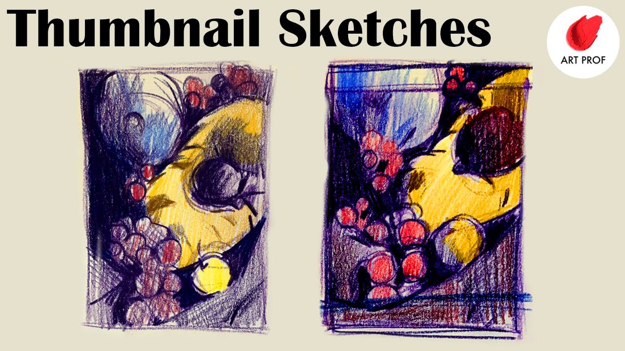
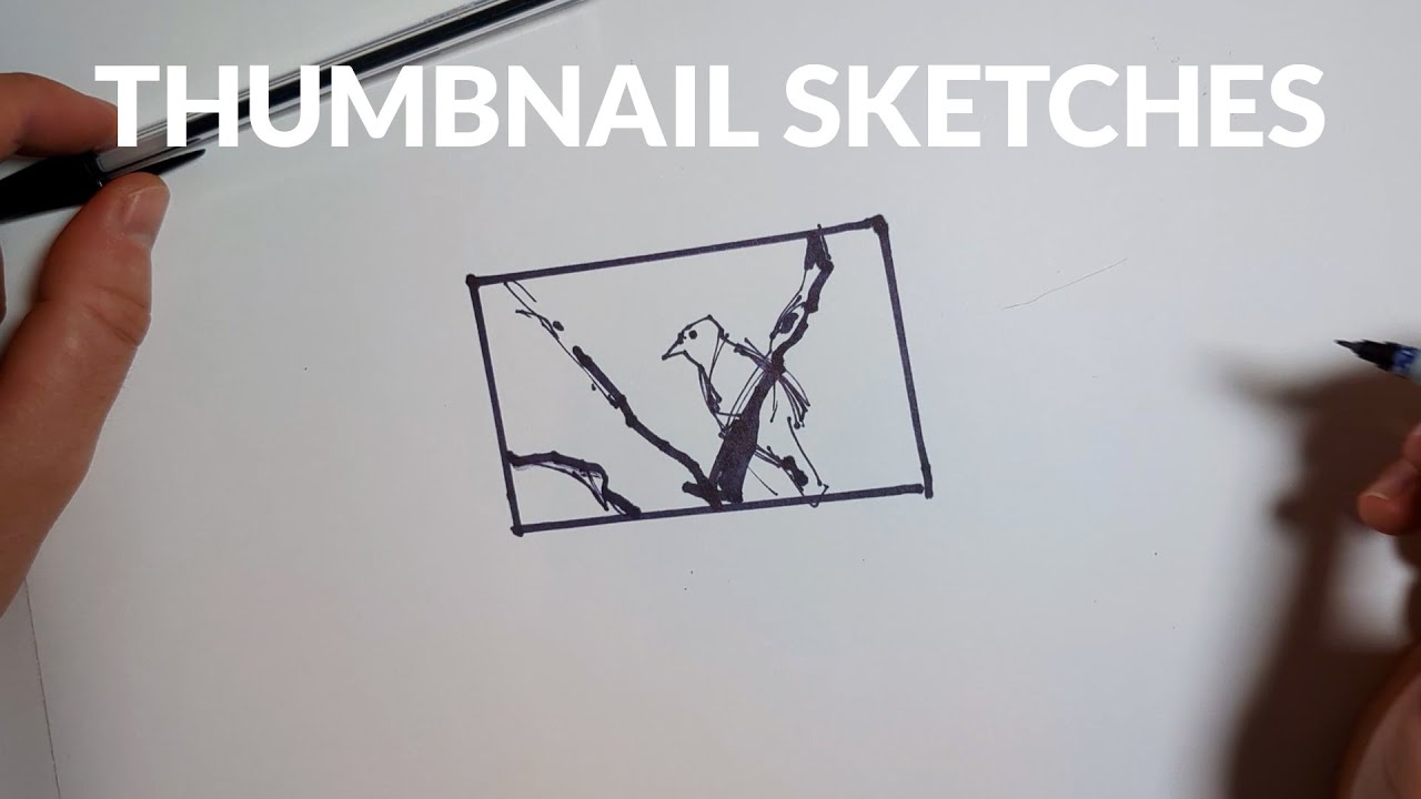
Thumbnail sketches are compact, rapid drawings that capture the core idea of a composition before any polish is added. They act like a cognitive shortcut, letting the mind test multiple possibilities with minimal friction. Instead of getting stuck on details, beginners can block in composition, hierarchy, and visual flow in minutes, then expand only the options that show promise. In fast-moving projects, these micro-studies prevent costly rework and help ideas evolve from vague to concrete with remarkable speed.
Consider a junior designer, Ava, tasked with a poster for a local festival. Starting with full-size layouts would invite perfectionism too early. By thumbnailing ten or twenty tiny frames, Ava experiments with visual weight, type placement, and illustration anchoring without worrying about color or texture. The result is a short list of viable directions that all align with the brief, ready for stakeholder feedback. This is the real magic: high-volume, low-cost exploration that exposes hidden gems while filtering out weak compositions.
Small scale amplifies problem-finding. Because every stroke must count, imbalance becomes obvious: a headline that competes with the hero image, an illustration that crowds margins, or a dead zone in the upper-right corner. By catching those flaws early, novices avoid the trap of “polishing the wrong idea.” The tactile aspect matters too. When the hand moves quickly—whether on paper or tablet—ideation feels playful, and that playfulness fuels originality.
Why thumbnails accelerate learning and reduce risk
Many beginners ask: why not jump straight into software? The answer is constraint. Working small removes the temptation to decorate. It encourages divergent thinking and supports a “fail fast” mindset borrowed from agile product teams. Generating 20–50 micro-ideas is not excess; it’s insurance that the final direction is truly strong. Modern workflows can blend analog intuition with digital precision, but the first pass benefits from the looseness of small, quick marks.
- ✏️ Speed over polish: make 10–15 variations in under 15 minutes to surface patterns.
- 🧠 Cognitive focus: small frames force attention on hierarchy, balance, and negative space.
- 🔁 Iterative safety: discard weak options quickly without sunk-cost bias.
- 🤝 Collaboration-ready: easy to share on a call or whiteboard for fast alignment.
- 🌱 Sustainable habits: a Moleskine or Strathmore pad paired with digital capture keeps waste low.
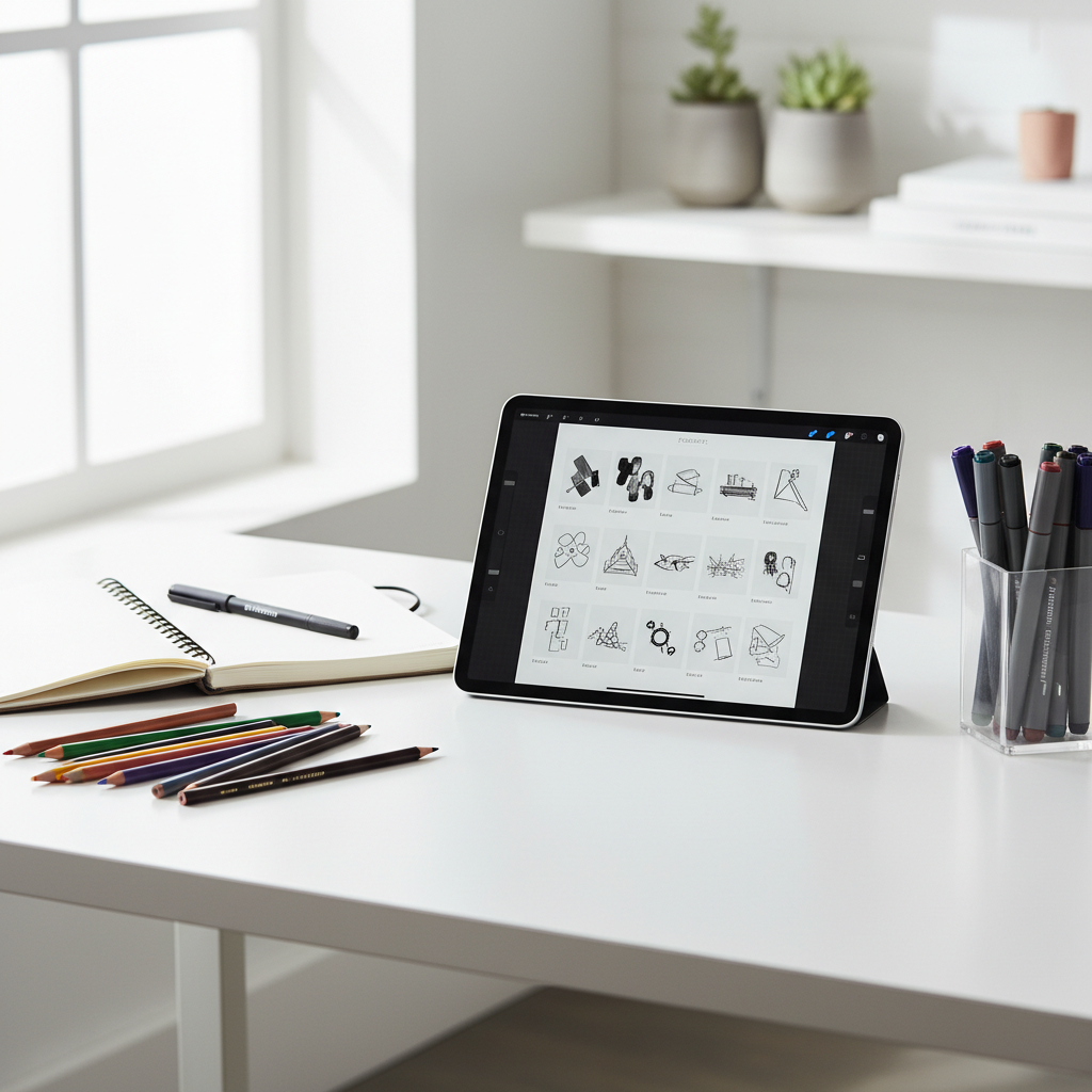
Tools are intentionally simple. A Sakura Micron or Staedtler fineliner, a soft graphite from Faber-Castell or Derwent, or brush pens from Pentel work well. For color notes, many designers keep a limited set of Copic or Winsor & Newton markers on hand to test value structure fast.
| Approach 🔍 | Best For 🎯 | Typical Tools 🧰 | Beginner Tip 💡 |
|---|---|---|---|
| Analog thumbnails | Raw ideation and composition | Moleskine, Strathmore, Sakura, Staedtler | Use a single pen to avoid fussy detail |
| Digital thumbnails | Layered iterations and quick exports | Tablet + Procreate/Fresco/Figma Pen | Work at 25–40% opacity to stack variations |
| Hybrid workflow | Analog feel with digital speed | Scan paper; refine with Copic palettes | Keep a consistent grid so options compare fairly |
As a closing thought for this section, it helps to treat thumbnails as thinking on paper—the fastest route from intuition to insight.

Step-by-step thumbnail sketch process for fast, confident results
A clear process keeps beginners from overworking early drafts. The goal is to set constraints, sprint through variations, and only then invest depth. This section lays out a practical sequence that teams use on brand campaigns, illustration assignments, and UI layouts.
From brief to short list: a reliable workflow
Start by clarifying who the work serves and why it exists. Jot verbs and adjectives—energetic, calm, premium, playful—to anchor later choices. A micro mood board can be assembled in minutes, using 6–8 images that reflect tone and layout references. Next, timebox the ideation phase: five-minute rounds create urgency and stop perfectionism from creeping in.
- 🧭 Clarify the brief: audience, message, constraints, deliverables.
- 🗂️ Collect references: 6–8 images or AI prompts to spark composition ideas.
- ⏱️ Timebox: two rounds of 5 minutes for rapid divergence.
- 🖊️ Sketch 20+ frames: vary focal point, balance, and orientation.
- 🔍 Evaluate: circle 3–5 candidates; note why they work.
- 🧪 Expand: upscale the top 1–2 frames for detail and type tests.
- 📤 Share: get quick feedback; capture decisions in writing.
To illustrate, Ava creates two pages of thumbnails for a coffee brand’s poster. In round one she explores hero-bean photography as a centered circle; in round two she shifts to diagonal steam trails guiding the eye to the call-to-action. The team chooses the diagonal option because the motion implies warmth and energy, aligning with the seasonal message.
| Round ⏱️ | Target Count 🧮 | Focus 🎯 | Quality Bar ✅ |
|---|---|---|---|
| Round 1 | 12–16 ideas | Composition variety | Loose lines, no detail, big shapes only |
| Round 2 | 8–10 ideas | Hierarchy and flow | Add value blocks; test two type spots |
| Refinement | 2–3 candidates | Feasibility checks | Test margins, scaling, and copy fit |
During refinement, optional color notes can help. A light pass with Prismacolor pencils or a neutral gray from Winsor & Newton markers gives just enough contrast to see value structure without committing to a palette.
When the short list is ready, capture rationale in a sentence per option: “Option A uses high contrast and Z-pattern reading to drive attention to the sign-up badge.” Clear notes ensure that feedback focuses on outcomes rather than personal taste. The final insight here is simple: a repeatable process turns creativity from a guessing game into a dependable habit.
Design principles and cognitive laws that make thumbnails work
Thumbnails become powerful when guided by the fundamentals of visual perception. Instead of relying on instinct alone, beginners can lean on a small set of dependable principles that explain why some frames feel balanced, legible, and memorable. The goal is to make each tiny frame do more with less—clarity, contrast, and rhythm in a postage-stamp space.
Principles to test inside every small frame
First, visual hierarchy: what element should the eye see first, second, and third? Size, contrast, and placement answer that question. Next, the rule of thirds or a simple grid helps avoid static centering; moving the focal point to a strong intersection often adds energy. Gestalt laws—proximity, similarity, and closure—explain why grouped items read as a unit and why incomplete shapes still feel whole. These laws are easy to test in thumbnails because there is no detail to mask structural mistakes.
- 🎯 Hierarchy: exaggerate the main shape; diminish support elements.
- 📐 Rule of thirds: push the focal point off-center for dynamism.
- 🧩 Gestalt: use proximity for grouping and closure for implied forms.
- 🌗 Value contrast: ensure the main subject reads in grayscale first.
- ↪️ Flow: guide the eye with diagonals, arcs, or repeating motifs.
Ava applies this to a landing-page header. She tests an F-pattern and a Z-pattern using rectangular blocks for image and copy. The Z-pattern wins because the call-to-action lands at the terminal point of the eye path, increasing the likely click. Because she checked value contrast early, the headline remains legible even on a busy background image.
| Principle 🧠 | What to Check 🔎 | Quick Test ⚡ | Fix if Weak 🧯 |
|---|---|---|---|
| Hierarchy | Clear first read | Squint test: does one shape dominate? | Scale up focal; reduce competing elements |
| Balance | Weight distribution | Flip horizontally: does it still feel stable? | Add counterweight shapes or adjust margins |
| Flow | Eye movement | Trace a path: does it end at the CTA? | Add leading lines or rhythmic repetition |
| Contrast | Light/dark clarity | Convert to grayscale | Increase value separation or simplify background |
The lasting takeaway is to judge thumbnails in grayscale first. If the structure reads at micro scale without color, the full-size design will carry its weight under real-world constraints.

Modern hybrid workflows: blending AI, digital tools, and sustainable habits
Today’s creative stacks combine paper, tablets, and intelligent assistance, but the core remains the same: thumbnail-first exploration. The hybrid approach unlocks speed and quality by letting the hand lead and the tools amplify. Beginners can adopt a lightweight toolkit without overspending while still enjoying professional-grade results.
Tools that play well together
For pure ideation, a Strathmore pad and Pentel brush pen provide speed and expressive lines. Once a few candidates stand out, scan or photograph them and drop the images into Procreate, Adobe Fresco, or Figma for layering and type trials. Use Copic neutrals to test value blocks, and pull out Prismacolor or Derwent colored pencils to suggest accents. A fine nib from Sakura or Staedtler is ideal for annotation, while Faber-Castell pencils handle soft shading. For color notes or markers on the go, Winsor & Newton remains a reliable choice.
- 🧩 Hybrid capture: sketch on paper, refine in layers, export variants quickly.
- 🛰️ Context testing: mock up thumbnails on devices, signage, or packaging early.
- 🔁 Feedback loops: share GIFs of iterations to show decision history.
- 🌱 Eco mindset: digitize routinely, and use recycled paper when printing.
- 🤖 AI prompts: generate quick mood grids, then hand-edit for authenticity.
AI helps when used as a starting spark rather than a replacement for judgment. Prompting “minimalist poster composition, heavy negative space, diagonal flow” can produce reference boards that widen exploration. After that, human selection and thumbnailing regain control, preserving originality while saving time. The same principle applies to LLM-based critique: paste a description of a thumbnail and request blind feedback on hierarchy, contrast, and reading path; then validate via quick redraws.
| Stage 🔧 | Tooling 🧰 | Outcome 🎯 | Efficiency Tip ⚙️ |
|---|---|---|---|
| Ideation | Paper + Sakura/Staedtler/Pentel | 20–40 tiny frames | Set a 10-minute timer; no erasing |
| Selection | Phone scan + Procreate/Fresco | 3–5 annotated candidates | Label layers: comp-A, comp-B, comp-C |
| Validation | Figma/Canva mockups | In-situ previews | Test at thumbnail size and billboard size |
| Color notes | Copic, Winsor & Newton, Prismacolor | Value and accent tests | Keep to 3-value system: light/mid/dark |
Sustainability matters across the workflow. A slim kit—one sketchbook, a small set of markers, and a tablet—reduces waste and context switching. The practical insight: let each tool do what it does best, then hand off to the next with as little friction as possible.
Practice drills, troubleshooting, and collaboration that build confidence
The fastest improvement comes from structured repetition. Short drills condition the eye to see composition, while troubleshooting routines remove friction when thumbnails feel flat. Collaboration habits ensure that early sketches translate into aligned decisions rather than subjective debates.
Skill-building drills for beginners
Set up a weekly cadence. Two days focus on composition variety, one day on value structure, one day on flow and hierarchy, and one day on style exploration. To keep it fresh, rotate subject matter: product packaging on Monday, character gestures on Wednesday, poster layouts on Friday. Maintain a compact toolkit—Moleskine or Strathmore sketchbook, Sakura fineliner, one Pentel brush pen, and three neutral Copic markers—so setup is never a barrier.
- ⏱️ Speed round: 30 thumbnails in 20 minutes, big shapes only.
- 🌗 Value ladder: each frame uses 3 values—light, mid, dark.
- 🔄 Remix drill: take a favorite frame, produce 6 variations.
- 🎳 Constraint play: only diagonals, or only circles, for 10 frames.
- 🧭 Hierarchy test: swap focal points and observe impact.
When thumbnails stall, use diagnostic questions: Is there a dominant shape? Does the eye know where to land first? Are margins consistent? A flip test—mirroring the frame—often reveals imbalance. For beginners, aligning with a simple grid keeps elements from drifting. Color temptation can wait; value clarity should lead.
| Problem 🚧 | Likely Cause 🧩 | Quick Fix 🛠️ | Preventive Habit 🛡️ |
|---|---|---|---|
| Muddy focal point | Weak contrast or competing elements | Darken subject; lighten background | Do a 3-value pass before details |
| Static layout | Everything centered | Shift focal to thirds; add diagonal | Start with three off-center variations |
| Crowded edges | Insufficient padding | Increase margins; crop secondary art | Mark a safe area around the frame |
| No reading path | Even spacing, no rhythm | Introduce scale contrast | Design an intentional Z or F path |
Collaboration improves outcomes when feedback is structured. Ask reviewers to respond to objectives, not aesthetics: “Does this composition make the CTA obvious?” rather than “Which do you like?” Share a sheet of three circled options with one-line rationales. On remote teams, lightweight loops—Slack threads with marked-up thumbnails, quick polls, or a Figma page with pinned comments—produce clarity without meetings.
A final practice insight: track iterations. A small gallery of dated pages shows progress, highlights recurring strengths, and builds a personal library of layouts that future projects can borrow from with confidence.
How small should a thumbnail sketch be?
Aim for 2–5 cm on the long edge. The constraint encourages big-shape thinking and prevents premature detailing.
Which tools are best for beginners?
Keep it simple: a Strathmore or Moleskine sketchbook, a Sakura or Staedtler fineliner, a Pentel brush pen, and a couple of Copic or Winsor & Newton neutrals. Add Prismacolor or Derwent colored pencils only for light color notes.
How many thumbnails should be made per idea?
Generate 20–50 micro-variations across two short timed rounds. Volume reveals patterns and protects against locking into a weak direction.
Can thumbnails be done entirely digitally?
Yes. Work on a small canvas with low-opacity layers to stack ideas quickly. The key is to resist detail and judge each frame in grayscale before adding color.
When should color be explored?
After structure is solid in grayscale. Use a three-value system first; then add restrained color notes with Copic markers or Prismacolor pencils to test emphasis without overcommitting.
Max doesn’t just talk AI—he builds with it every day. His writing is calm, structured, and deeply strategic, focusing on how LLMs like GPT-5 are transforming product workflows, decision-making, and the future of work.


international entrepreneur rule update: what changes in 2025 mean for global startups
Navigating the 2025 International Entrepreneur Rule Update The landscape for global startups looking to breach the American market has shifted...

Shortcut to size pdf: how to access and use the guide for muscle growth
Decoding the Architecture of Muscle Growth In the world of physical optimization, efficiency is the primary metric. The concept of...


Unlocking the power of iconography pdfs: essential guide for 2025
Unlocking the Strategic Value of Visual Communication in 2025 In today’s statistical-first world, effective communication often happens in milliseconds. Users...


San Francisco Startups: Key Trends to Watch in 2025
AI-Native Momentum in San Francisco Startups: Foundation Models, Agents, and Safety Across San Francisco, the most visible shift in 2025...


how to apply a promo code on study.com: step-by-step guide for august 2025
Navigating Education Savings with Study.com in August 2025 As the academic landscape continues to evolve, finding cost-effective solutions for online...


The best bond movies ranked: a definitive guide for 2025
The Future of Espionage and the Legacy of 007 in 2025 As we navigate through 2025, the cinematic landscape is...


Best male hairstyles for round faces: top trendy looks for 2025
Optimizing Facial Symmetry: The Logic Behind Haircuts for Round Faces Finding the optimal aesthetic for a round face shape is...


Explore the Top 5 Free NSFW AI Chatbots to Try in 2025
The Rise of Unfiltered Digital Companions in the 2025 Landscape The digital horizon has expanded significantly, and the way humans...


OpenAI vs Quora: Choosing Between ChatGPT and Poe for AI Tools in 2025
Navigating the AI Ecosystem: The 2025 Showdown In the rapidly evolving landscape of Artificial Intelligence, the year 2025 has brought...


Mini blocks: creative building ideas and tips for beginners in 2025
Mastering Mini Blocks: A Tactile Renaissance in 2025 In an era dominated by augmented reality and digital interfaces, the tactile...


Super claude code: how to maximize your coding efficiency in 2025
It’s no longer about simply having access to the most powerful AI; it’s about how you wield it. As we...


Essential ap world term flashcards pdf for effective 2025 exam prep
Streamlining Your 2025 AP World History Strategy with Digital Tools Success in the AP World History exam isn’t just about...


Tp test paper explained: key points, uses, and expert tips in 2025
Navigating the Teleperformance Assessment Ecosystem in 2025 The recruitment landscape has evolved significantly, with data-driven evaluations becoming the standard for...


Must-Watch AI Movies to Look Forward to in 2025
The Evolution of Cinema: Why AI Films Are Dominating 2025 The landscape of visual storytelling has shifted dramatically over the...


Notion AI vs. ChatGPT: A 2025 Feature Showdown to Supercharge Your Productivity
The digital landscape of 2025 has become crowded with intelligent assistants, each promising to revolutionize how work gets done. While...


Ftfy meaning explained: what does ftfy stand for in 2025 internet slang?
Decoding the FTFY meaning in modern digital language Navigating the complex landscape of internet slang requires more than just a...


Top words that start with tu: expand your English vocabulary
Unlocking the Potential of “TU” Vocabulary in Professional Communication Mastering a precise vocabulary is akin to optimizing code; the right...


How to use an ap spanish score calculator for accurate results in 2025
Optimizing Your Strategy with an AP Spanish Score Calculator Achieving a top tier result on the AP Spanish Language and...


A look at interesting things that start with ai
Unveiling the Hidden Layers of Modern Intelligence The landscape of technology has shifted dramatically by 2025. Artificial Intelligence is no...


sim failure explained: common causes and quick fixes in 2025
Your iPhone is your lifeline to the digital world, handling everything from urgent emails to streaming the latest podcast. So,...
-

 Open Ai2 months ago
How to Effortlessly Access Your Archived Conversations on ChatGPT in 2025
-

 Open Ai2 months ago
A Comprehensive Guide to Sharing Your ChatGPT Conversations: 2025 Edition
-

 Tools1 month ago
How to download and use open subtitles for movies and TV in 2025
-

 Actualités1 month ago
Ontario Man Claims ChatGPT Prompted Psychosis During ‘World-Saving’ Quest
-

 Actualités2 months ago
OpenAI Reports That Hundreds of Thousands of ChatGPT Users May Experience Symptoms of Manic or Psychotic Episodes Weekly
-

 Ai models2 months ago
MIT Researchers Introduce ‘SEAL’: A Game-Changer in the Evolution of Self-Enhancing AI

