Tools
i bubble letter: creative ideas and tutorials for beginners
How to Draw an i Bubble Letter: Step-by-Step Tutorial for Absolute Beginners
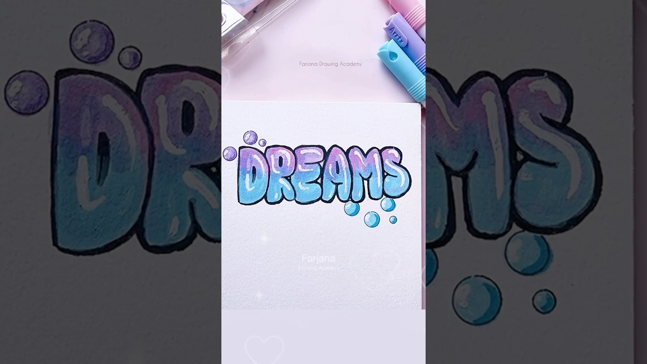
Starting with the lowercase i bubble letter is a smart way to learn the flow of beginner lettering. The form is compact, it teaches control over roundness and spacing, and it leaves plenty of room for personality in the dot. A simple pencil, a clean sheet, and a relaxed wrist are enough to begin. The process below helps learners create consistent results without feeling overwhelmed.
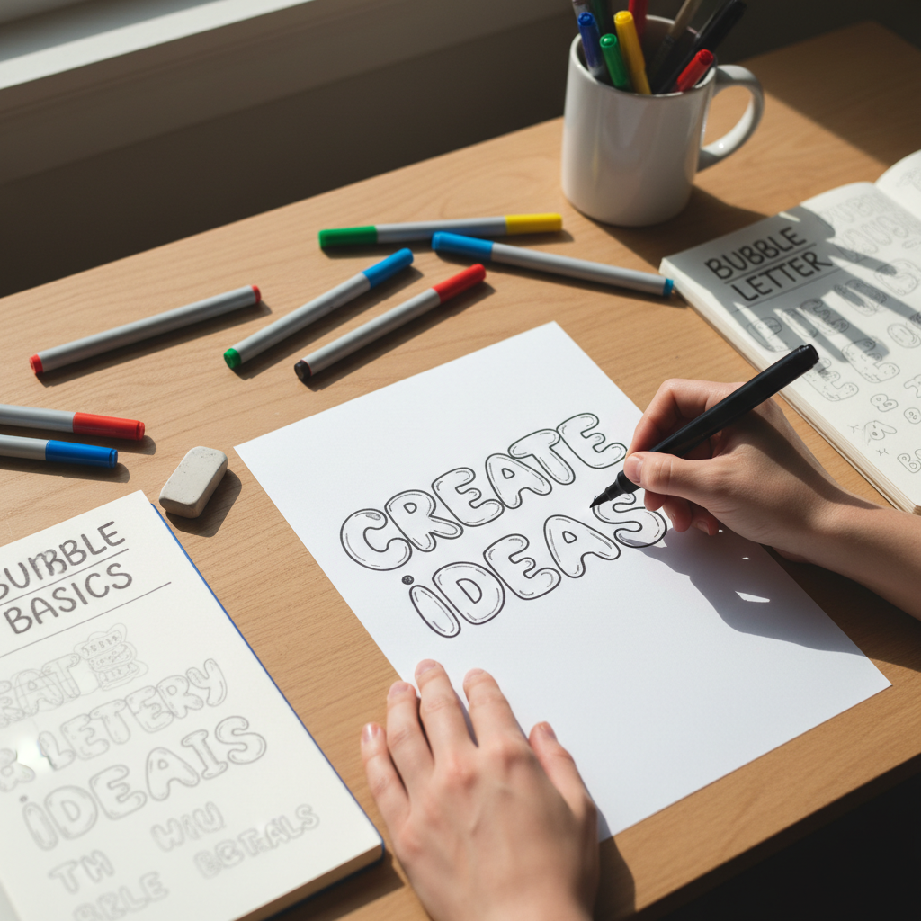
Step-by-step guide to drawing letters with a bubbly look
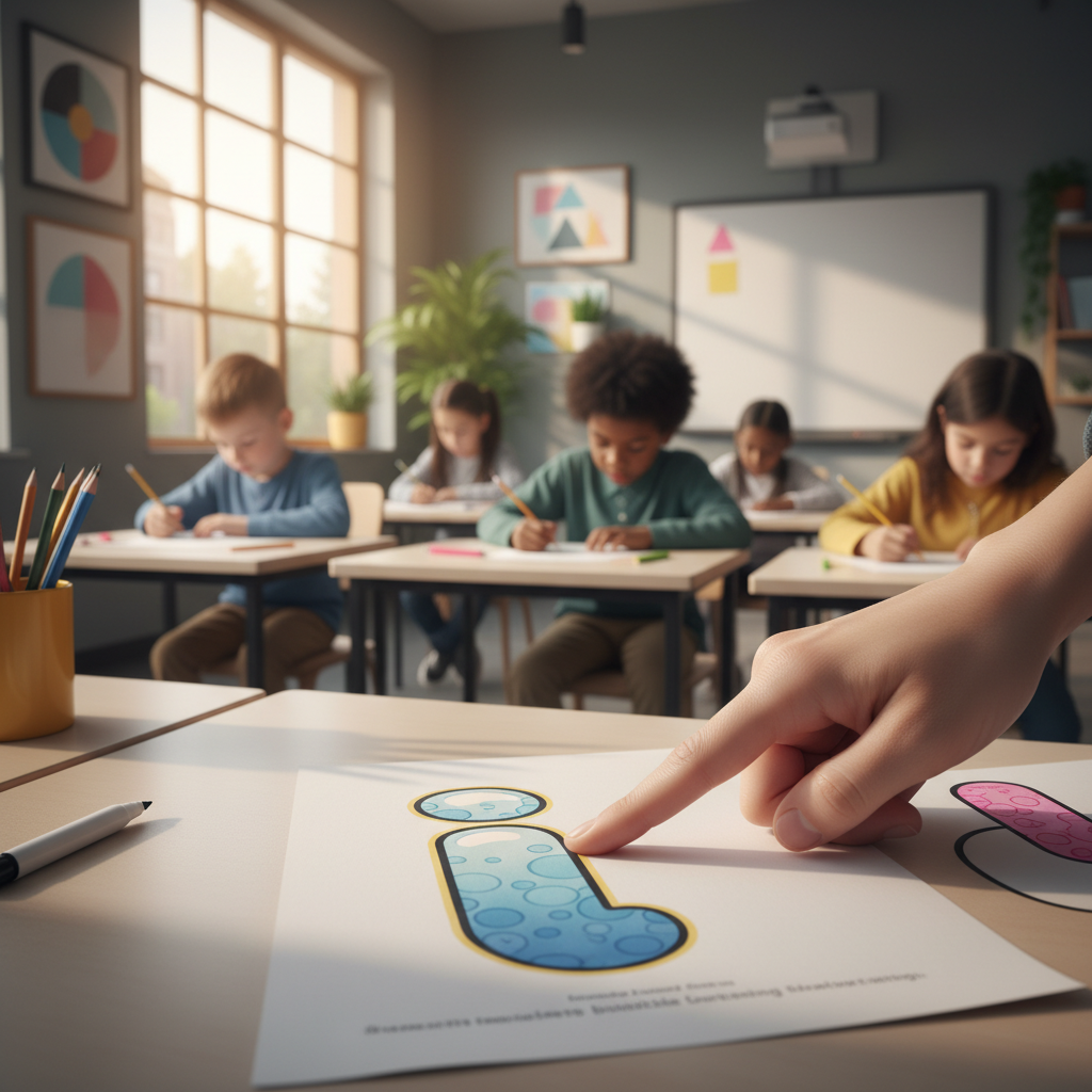
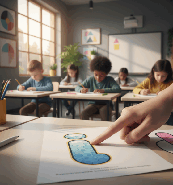
Begin with a light guide. Draw a straight vertical stem about the height of your thumb, then add a small guide circle above it for the dot. The key to drawing letters in bubble style is inflating the skeletal line outward with soft, even curves. Imagine a balloon inflating around the skeleton of the letter and trace that outer contour.
- ✏️ Outline the stem: Sketch a soft rectangle with rounded corners around your stem. Keep widths consistent to avoid wobble.
- ⭕ Shape the dot: Turn the guide circle into a puffy orb. Aim for symmetry so the dot doesn’t feel lopsided.
- 💧 Add a highlight: Leave a small white oval near the top-left of both shapes for a glossy effect.
- 🌫️ Drop shadow: Offset a faint shadow to the lower-right to make the bubble letters pop from the page.
- 🧼 Clean lines: Ink with a smooth pen and erase pencil lines once dry to reveal crisp letter design.
New learners often press too hard. Keep the pencil whisper-light and treat curves like you’re rolling a coin under your palm. A short warm-up with circles and slow arcs prevents shaky edges and helps build confidence for hand lettering and calligraphy for beginners. Consider using a ruler to mark the cap height and baseline so the dot sits consistently above the stem.
Add shine, shadow, and texture
To introduce depth, place a soft gradient from the top-left (light) to the bottom-right (darker). A colored pencil can glaze over markers to create a satin feel, or a touch of white gel pen can simulate glare. For a textured look, dab tiny dots near the edges, then fade them inward. This stippling reads as a velvety surface and makes simple bubble letter art look polished.
A quick story from a classroom demo shows the value of patient shading. A student named Maya rushed highlights across the center; shifting them to the edge instantly transformed the letter from flat to luminous. Consistency beats speed in creative lettering.
| Tool 🛠️ | Affordable Alternative 💸 | Pro Tip ⭐ |
|---|---|---|
| Bristol paper | Printer paper (smooth side) | Lightly tape corners to prevent smudges. |
| Fineliner (0.5–0.8) | Black gel pen | Use slower strokes around curves for clean edges. |
| Alcohol markers 🎨 | Colored pencils | Blend mid-tone first, then add darker rim for dimension. |
| White gel pen | Soft eraser for highlights | Place highlights consistently at the same light angle. |
| Kneaded eraser 🧽 | Regular eraser | Lift, don’t rub, to avoid tearing fibers. |
When a clean outline, steady highlight, and subtle shadow align, even a single i looks professional; mastery of this simple form is the foundation for expressive creative typography.
Creative Ideas to Style the Bubble Letter i: Themes, Effects, and Variations
Once the structure is set, style transforms the plain i bubble letter into a tiny canvas. Themes add narrative; effects add depth; and clever variations in the dot create instant personality. Whether for stickers, classroom posters, or social posts, the ideas below offer a menu of looks that stay friendly to beginners without sacrificing impact.
Style ideas that make the dot do the talking
Think of the dot as a logo within a logo. A star, heart, planet, or emoji sits naturally over the stem and signals mood at a glance. For a sporty vibe, a mini basketball with classic panel lines works well; for a tech feel, try a glossy orb with a subtle grid. Adding freckles, sparkles, or tiny motion lines can suggest animation without complicated drawing.
- 🍩 Frosted donut: Pink glaze, multicolor sprinkles, and a bite mark on the dot.
- 🧪 Slime drip: Oozing edges along the stem, translucent dot with bubbles.
- 🌿 Botanical: Vines climbing the stem, leaf-shaped dot for organic calm.
- 🎧 Neon sign: Electric glow outline; dot as a glowing node.
- 🧊 Glass: Soft inner shadows; dot with refracted highlight.
- 🧱 Graffiti tag: Bold fill, outer halo, and a paint splatter dot.
Palettes can be pre-planned to avoid muddy blends. Pair one dominant hue with a darker rim color and a subtle complement for highlights. For lettering tutorials in classrooms, teachers often assign a three-marker rule to keep choices focused and encourage intentional shading.
| Theme 🎭 | Palette (Hex) 🎨 | Shading Trick ✨ | Best Use-Case 📌 |
|---|---|---|---|
| Neon | #00E5FF, #001F3F, #FFFFFF | Outer glow ring with soft blur | Event flyers, livestream thumbnails |
| Donut 🍩 | #F99CB1, #8B5E3C, #FFE9C7 | Gloss streak + sprinkle shadows | Cafe menus, kid-friendly labels |
| Glass 🧊 | #AEE1F9, #6BAED6, #E6F7FF | Inner rim dark, outer edge light | Tech slides, modern packaging |
| Graffiti 🧱 | #FF4D4F, #222222, #FFD666 | Halo outline + splatter accents | Streetwear logos, mixtape art |
| Botanical 🌿 | #62C370, #2F5233, #E8FFE6 | Leaf vein highlights | Eco posters, wellness branding |
When designing for digital audiences, it helps to proof not just the art, but the copy that accompanies it. A cautionary case study from sports media shows how unchecked text can eclipse visuals. For creative lettering shared on social channels, a clean caption and accurate hashtags sustain attention on the art where it belongs.
Mixing effects keeps the lowercase i fresh: a neon-glass hybrid or a graffiti-botanical crossover balances playfulness with polish. The small form rewards bold experimentation and makes the bubble letter art easy to iterate until a signature style emerges.
Beginner Lettering Practice Routines: Worksheets, Warm-ups, and Error Fixes for the Bubble i
Repetition refines muscle memory. Short, focused practice sessions outperform marathon sketching, especially for those new to beginner lettering. A 15-minute routine that blends drills, a quick study, and one finished letter keeps progress measurable without fatigue.
Warm-ups that stick
Start with three lines of slow ellipses, then trace gentle S-curves to steady the wrist. Next, draw a ladder of stems with even widths; cap each with a dot to test spacing. These drills carry over to calligraphy for beginners, where rhythm and pressure control are everything.
- ⏱️ 5 minutes: Ellipses and S-curves for motion control.
- 📏 5 minutes: Stem ladders with consistent widths.
- 🖊️ 5 minutes: One polished i with shading and a simple background.
Worksheets help beginners visualize consistent proportions. Print guides with baseline, x-height, and dot height. For smaller hands, enlarge the grid so the dot isn’t crowded; for advanced learners, shrink it to challenge precision. Add a mini checklist in the margin: light source, shadow angle, rim thickness, dot alignment.
Common errors and quick recoveries
Most issues trace back to speed or symmetry. Dots drift off-center, stems wobble, and highlights can stray. The fix is systematic: map a vertical center line, slow the stroke near corners, and place highlights early so shading wraps around them. Confidence returns when learners see patterns in their mistakes.
| Issue ⚠️ | Likely Cause 🧩 | Quick Fix 🛠️ | Drill ✅ |
|---|---|---|---|
| Dot off-center | No center guide | Add a vertical guideline through the stem | Five dot placements over a ghost line |
| Wobbly edges | Fast curves | Slow down at corners; rotate paper | Trace circles, then inflate |
| Muddy shading | Too many layers | Limit to two tones + highlight | Two-tone fills on five mini i’s |
| Flat look | Highlight centered | Move highlight to rim | Highlight study with white pen |
| Uneven width | Inconsistent pressure | Outline first; fill after | Outline-only repeats |
Checklists also prevent preventable stumbles with text presentation around your art. An editorial oversight story widely shared online underscores how a small error can overshadow a creative piece. Add a final “read aloud once” step before publishing; it takes seconds and protects the work.
Practice compounds fast when sessions are short, structured, and tracked. A single-page log that records time spent, effect tested, and one insight builds momentum and confidence in letter design.
From Hand Lettering to Creative Typography: Turning the i Bubble Letter into Logos and Posters
Beyond sketchbooks, the i bubble letter can carry real messaging in logos, posters, and packaging. A single, well-styled i can serve as an icon, a wordmark starter, or a monogram for a brand with a playful voice. The leap from practice page to professional layout is about intention, alignment, and delivering files that print cleanly.
Brand-ready decisions that matter
Establish a mood board before touching the pen: audience, vibe, and environments where the graphics will live. A wellness studio might prefer soft glass with botanical undertones; a gaming channel might want neon with motion streaks. Pair the bubbly i with a neutral companion font to maintain readability in headlines—this is classic creative typography thinking.
- 🎯 Purpose first: Define use (favicon, packaging sticker, poster header).
- 🧭 Grid and spacing: Align the dot precisely over the stem; respect margins.
- 🎨 Limited palette: Two brand colors + a neutral make consistent assets.
- 📐 Export smart: Keep a vector outline for scaling and a PNG for quick shares.
Case in point: a pop-up tea bar used a glass-style i as its icon, then repeated the dot as a pattern across cups and napkins. The trick was consistency—same highlight angle everywhere—so the identity felt intentional rather than improvised. That’s the difference between hobby art and brand-ready hand lettering.
| Use-Case 🚀 | Deliverable 📦 | Color Mode 🎚️ | Output Tip 🧠 |
|---|---|---|---|
| Logo mark | SVG + PDF | CMYK + Pantone | Expand strokes before export |
| Poster header | High-res PNG | CMYK for print | 300 DPI and 3 mm bleed |
| Social avatar | Square PNG | RGB | Center dot; check legibility at 64 px |
| Sticker sheet | Vector cut file | Spot color | Separate die line on its own layer |
Care extends to the text paired with your artwork. A widely shared AI error in sports media became a lesson in proofing every public-facing element. Understanding what went wrong in that newsroom example helps creatives maintain trust when their art goes live. For campaign rollouts, set a simple review gate: art check, copy check, export check.
When layouts respect grids, color systems, and file hygiene, the bubbly i evolves from a cute study to a versatile, memorable brand motif that reads clearly from thumbnails to billboards.
Digital Tools and Accessibility: Pro Tips for Bubble Letters on Tablets and in Classrooms
Tablets and budget design apps in 2025 put lettering tutorials within reach for students, hobbyists, and small teams. Pressure-sensitive brushes simulate markers, while vector tools ensure crisp scaling for print. The secret is organizing layers, building small libraries, and designing with accessibility in mind.
Tablet workflows that feel natural
Set up layers like a physical desk: guides on the bottom, sketch in the middle, ink on top, and effects above that. Lock guides to avoid accidental edits, and name layers with verbs like “ink,” “shadow,” and “glow.” For speed, create brush presets labeled “rim,” “fill,” and “highlight” so the i bubble letter stays consistent across variations.
- 🗂️ Layer logic: Guides → Sketch → Ink → Color → Shadows → Highlights → Texture.
- 📚 Asset library: Save the dot in multiple styles (star, glass, neon) for rapid swaps.
- 🧪 Non-destructive: Use clipping masks for shading; avoid painting directly on ink.
- 🔁 Versioning: Export V1, V2, V3 to compare glow intensity and thickness.
For classrooms, shared drives with template canvases keep everyone aligned. Students can duplicate a baseline file with pre-set grids and color swatches, then focus on creative lettering rather than file setup. Accessibility matters too: contrast ratios, legible shapes at small sizes, and alt text for digital galleries help every viewer engage with the work.
| App 💻 | Skill Focus 🧭 | Best Feature 🌟 | Budget 💵 |
|---|---|---|---|
| Procreate | Hand lettering | Pressure brushes + clipping masks | One-time purchase |
| Affinity Designer | Vector letter design | Contour + expand stroke tools | One-time purchase |
| Figma | Creative typography | Components + team libraries | Free tier |
| Canva | Beginner lettering | Templates + brand kits | Free with Pro option |
Even in digital flows, content checks stay essential. Consider this guidance on avoiding tech-driven blunders as a reminder to proof captions, alt text, and overlays before publishing. Assign a peer to review for color contrast and typographic hierarchy so nothing competes with the form of the letter itself.
For educators, small challenges keep lessons lively: “design an i bubble letter that passes contrast accessibility checks,” or “ship three variants in 30 minutes using a shared asset library.” These constraints simulate real creative briefs, preparing students to ship strong work on tight timelines while keeping the heart of bubble letters—clarity and charm—front and center.
FAQ on i Bubble Letter Techniques, Practice, and Styling
What size should the dot be compared to the stem in an i bubble letter?
Aim for a dot width roughly 75–100% of the stem width. Smaller dots feel timid; oversized dots can dominate. Keep it centered above the stem with a consistent gap equal to about half the stem width.
How can beginners keep their outlines smooth without special tools?
Work slowly around corners, rotate the paper instead of bending your wrist, and outline with a pencil first. Ink over confident lines, then erase guides. Practicing ellipses for two minutes warms up the motion needed for smooth curves.
What’s the easiest shading setup for a glossy look?
Pick a single light source (top-left is popular), fill with a mid-tone, deepen the lower-right edge, and reserve a white highlight along the top-left rim. A small white gel pen streak finishes the effect.
Which digital file format is best for scaling a bubble letter i?
Export a vector file like SVG or PDF for infinite scaling. Keep a high-resolution PNG with transparent background for quick posts and mockups.
How do beginners choose a color palette without clashing?
Use one dominant color, one darker rim color for depth, and a neutral for highlights or background. Test palettes as small swatches next to each other before filling the letter.
Jordan has a knack for turning dense whitepapers into compelling stories. Whether he’s testing a new OpenAI release or interviewing industry insiders, his energy jumps off the page—and makes complex tech feel fresh and relevant.


Discovering the beauty of words ending in ia
The Linguistic Architecture of the Suffix -ia Language operates much like a complex codebase; small components, when assembled correctly, create...


Understanding the gall-peters map projection: benefits and controversies in 2025
The Reality Behind the Map: Why the Gall-Peters Projection Still Matters Every time you look at a standard world map,...


how to create a secure building link login process in 2025
Architecting a Robust Authentication Framework in the Era of AI User authentication defines the perimeter of modern digital infrastructure. In...


Top AI Tools for Small Businesses: Essential Picks for 2025
Navigating the AI Landscape: Essential Tools for Small Business Growth in 2025 The digital horizon has shifted dramatically. As we...


Choosing Between OpenAI’s ChatGPT and Falcon: The Best AI Model for 2025
The landscape of artificial intelligence has shifted dramatically as we navigate through 2026. The choice is no longer just about...


discover the most fascinating shell names and their meanings
Decoding the Hidden Data of Marine Architectures The ocean functions as a vast, decentralized archive of biological history. Within this...

Funko pop news: latest releases and exclusive drops in 2025
Major 2025 Funko Pop News and the Continuing Impact in 2026 The landscape of collecting changed drastically over the last...

who is hans walters? uncovering the story behind the name in 2025
The Enigma of Hans Walters: Analyzing the Digital Footprint in 2026 In the vast expanse of information available today, few...


Exploring microsoft building 30: a hub of innovation and technology in 2025
Redefining the Workspace: Inside the Heart of Redmond’s Tech Evolution Nestled within the greenery of the expansive Redmond campus, Microsoft...


Top AI Tools for Homework Assistance in 2025
The Evolution of Student Support AI in the Modern Classroom The panic of a Sunday night deadline is slowly becoming...


OpenAI vs Mistral: Which AI Model Will Best Suit Your Natural Language Processing Needs in 2025?
The landscape of Artificial Intelligence has shifted dramatically as we navigate through 2026. The rivalry that defined the previous year—specifically...


how to say goodbye: gentle ways to handle farewells and endings
Navigating the Art of a Gentle Farewell in 2026 Saying goodbye is rarely a simple task. Whether you are pivoting...


pirate ship name generator: create your legendary vessel’s name today
Designing the Perfect Identity for Your Maritime Adventure Naming a vessel is far more than a simple labeling exercise; it...


Unlocking creativity with diamond body AI prompts in 2025
Mastering the Diamond Body Framework for AI Precision In the rapidly evolving landscape of 2025, the difference between a generic...


What is canvas? Everything you need to know in 2025
Defining Canvas in the Modern Digital Enterprise In the landscape of 2026, the term “Canvas” has evolved beyond a singular...

how to turn on your laptop keyboard light: a step-by-step guide
Mastering Keyboard Illumination: The Essential Step-by-Step Guide Typing in a dimly lit room, on a night flight, or during a...


best book mockup prompts for midjourney in 2025
Optimizing Digital Book Visualization with Midjourney in the Post-2025 Era The landscape of digital book visualization shifted dramatically following the...


AI-Driven Adult Video Generators: The Top Innovations to Watch for in 2025
The Dawn of Synthetic Intimacy: Redefining Adult Content in 2026 The landscape of digital expression has undergone a seismic shift,...

ChatGPT vs LLaMA: Which Language Model Will Dominate in 2025?
The Colossal Battle for AI Supremacy: Open Ecosystems vs. Walled Gardens In the rapidly evolving landscape of artificial intelligence, the...


Mastering initial ch words: tips and activities for early readers
Decoding the Mechanism of Initial CH Words in Early Literacy Language acquisition in early readers functions remarkably like a complex...
-

 Tech1 month ago
Your card doesn’t support this type of purchase: what it means and how to solve it
-

 Open Ai2 months ago
Mastering Your ChatGPT API Key: A Comprehensive Guide for 2025
-

 Actualités2 months ago
Ontario Man Claims ChatGPT Prompted Psychosis During ‘World-Saving’ Quest
-

 Tools2 months ago
How to download and use open subtitles for movies and TV in 2025
-

 Ai models2 months ago
vietnamese models in 2025: new faces and rising stars to watch
-

 Actualités2 months ago
Unlock the Power of ChatGPT Group Chat for Free: A Step-by-Step Guide to Getting Started