
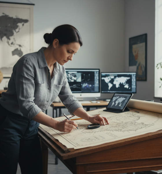
The Reality Behind the Map: Why the Gall-Peters Projection Still Matters
Every time you look at a standard world map, you are being lied to. It isn’t a malicious deception, but a mathematical necessity. Flattening a spherical planet onto a rectangular screen or sheet of paper inevitably creates map distortion. For centuries, the Mercator projection dominated our walls and navigation apps, famously inflating the size of Northern Hemisphere landmasses. However, the Gall-Peters projection emerged as a fierce challenger, prioritizing geographical accuracy regarding size over shape. As we navigate the digital landscape of 2026, understanding this projection is about more than just cartography; it is about how we perceive our world’s geopolitical balance.
Shifting Perspectives: The Equal-Area Advantage
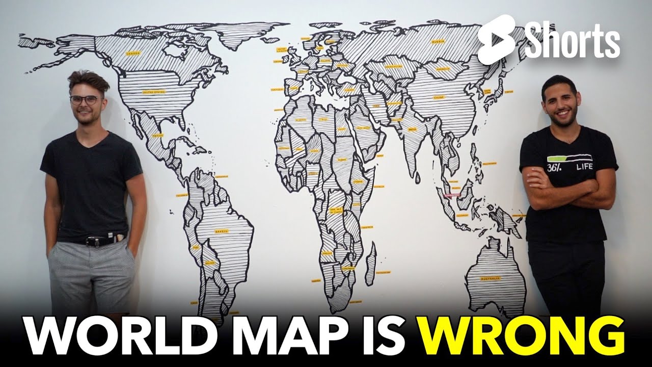
The defining feature of the Gall-Peters map is its status as a cylindrical equal-area projection. Unlike the Mercator, which stretches the poles to infinity, this model ensures that landmasses retain their correct surface area relative to one another. On a traditional map, Greenland often appears roughly the same size as Africa. In reality, and as correctly depicted by Gall-Peters, Africa is approximately 14 times larger than Greenland. This correction provides a startlingly different visual of the globe, shrinking Europe and North America while emphasizing the vastness of the Global South, particularly Africa and South America.
This shift in visual weight has made the projection a favorite among educators and social justice advocates. By presenting countries in their true proportions, the map challenges unconscious biases regarding the importance of nations based on their plotted size. While the shapes appear elongated—stretched vertically near the equator and squashed near the poles—this aesthetic sacrifice is the price paid for spatial equality. It forces the viewer to confront the true physical magnitude of continents that have historically been minimized in standard cartography.
A Legacy of Controversy: From 1855 to the Classroom of 2026
The history of this map is as distorted as the poles on a Mercator chart. Originally described by Scottish clergyman James Gall in 1855, the projection languished in obscurity until 1973. It was then that German historian Arno Peters unveiled it as a “new” invention, sparking one of the most heated mapping controversies of the 20th century. Peters argued that the Mercator projection was a tool of Eurocentric imperialism 🌍, designed to make colonial powers appear dominant.
The Political Battleground of Maps
The cartographic community pushed back hard against Peters, citing his lack of novelty and his aggressive marketing which often disregarded established science. Yet, the message stuck. Organizations like UNESCO and various NGOs adopted the map to promote cultural representation and fairness. This wasn’t just about geography; it was a battle over the “narrative” of the world map. 🗺️
In recent years, we have seen a resurgence of this debate in public policy. Following the lead of Boston Public Schools in 2017, the state of Nebraska passed legislation in 2024 requiring the display of the Gall-Peters (or similar equal-area maps) in schools. In 2026, we see the ripple effects of these decisions, with a generation of students growing up with a dual understanding of the world: one for navigation (Mercator) and one for social proportionality (Gall-Peters).
Comparing the Giants: Mercator vs. Gall-Peters
To truly understand the projection benefits and drawbacks, one must look at the mathematical trade-offs. No flat map can be perfect; preserving one property always distorts another. Here is how the two major contenders stack up in the modern era.
| Feature | Mercator Projection | Gall-Peters Projection |
|---|---|---|
| Primary Goal | Navigation & Direction (Angles are correct) | Area Accuracy (Sizes are correct) |
| Visual Distortion | Exaggerates size of poles (Greenland, Antarctica) | Distorts shapes (elongates tropics, flattens poles) |
| Key Usage | Google Maps, Marine Navigation ⚓ | UN data, Education, Social Justice context 🎓 |
| Geographic Fairness | Eurocentric bias (enlarges North America/Europe) | Egalitarian focus (emphasizes Global South) |
Geographic Trends and Future Applications
As we move further into the late 2020s, the rigid “either/or” mentality is fading. Digital platforms now allow users to toggle between geographic trends and views instantly. The Gall-Peters projection has found a permanent niche not as a replacement for navigation, but as a necessary tool for data visualization. When plotting climate change data, population density, or resource distribution, using an equal-area map is crucial to avoid misleading statistics.
The adoption of this projection highlights a broader shift in how we consume information. We are increasingly skeptical of “default” settings. Whether it is in a Nebraska classroom or a global demographic report, the Gall-Peters map serves as a reminder that the lens through which we view the world shapes our reality.
Here are the distinct advantages that keep the Gall-Peters relevant today:
- Social Equity: It restores the visual importance of developing nations in South America, Africa, and Southeast Asia. 🤝
- Resource Visualization: Essential for accurately displaying data related to land use, deforestation, and agriculture where square mileage matters. 📉
- Educational Shock Value: It effectively disrupts students’ preconceived notions about world geography, prompting critical thinking. 🧠
- Political Neutrality: By strictly adhering to area, it avoids the subconscious bias of making northern powers appear physically dominant.
Why does Africa look so long on the Gall-Peters map?
The Gall-Peters projection is an equal-area cylindrical projection. To maintain the accurate surface area of landmasses near the equator (like Africa) without widening the map, the mathematics of the projection stretches these regions vertically, resulting in a distinct, elongated appearance compared to other maps.
Is the Gall-Peters map accurate for navigation?
No, it is not recommended for navigation. While it preserves area, it distorts angles and shapes. Navigators typically rely on the Mercator projection (or conformal maps) because a straight line drawn on them represents a constant compass bearing, which is crucial for plotting courses at sea or in the air.
Why are schools switching to the Gall-Peters projection?
Educational institutions, such as Boston Public Schools and districts in Nebraska, have adopted this map to provide a more accurate representation of the relative sizes of continents. It is used as a tool to decolonize the curriculum and challenge the Eurocentric bias found in traditional maps that exaggerate the size of Northern Hemisphere countries.
Did Arno Peters invent this projection?
Technically, no. The projection was first described by clergyman James Gall in 1855, who presented it at a science convention. Arno Peters independently devised a nearly identical projection in the 1970s and popularized it. While often called the Peters projection by supporters, the cartographic community recognizes the dual contribution as the Gall-Peters projection.
Jordan has a knack for turning dense whitepapers into compelling stories. Whether he’s testing a new OpenAI release or interviewing industry insiders, his energy jumps off the page—and makes complex tech feel fresh and relevant.


Understanding the gall-peters map projection: benefits and controversies in 2025
The Reality Behind the Map: Why the Gall-Peters Projection Still Matters Every time you look at a standard world map,...


how to create a secure building link login process in 2025
Architecting a Robust Authentication Framework in the Era of AI User authentication defines the perimeter of modern digital infrastructure. In...


Top AI Tools for Small Businesses: Essential Picks for 2025
Navigating the AI Landscape: Essential Tools for Small Business Growth in 2025 The digital horizon has shifted dramatically. As we...


Choosing Between OpenAI’s ChatGPT and Falcon: The Best AI Model for 2025
The landscape of artificial intelligence has shifted dramatically as we navigate through 2026. The choice is no longer just about...


discover the most fascinating shell names and their meanings
Decoding the Hidden Data of Marine Architectures The ocean functions as a vast, decentralized archive of biological history. Within this...

Funko pop news: latest releases and exclusive drops in 2025
Major 2025 Funko Pop News and the Continuing Impact in 2026 The landscape of collecting changed drastically over the last...

who is hans walters? uncovering the story behind the name in 2025
The Enigma of Hans Walters: Analyzing the Digital Footprint in 2026 In the vast expanse of information available today, few...


Exploring microsoft building 30: a hub of innovation and technology in 2025
Redefining the Workspace: Inside the Heart of Redmond’s Tech Evolution Nestled within the greenery of the expansive Redmond campus, Microsoft...


Top AI Tools for Homework Assistance in 2025
The Evolution of Student Support AI in the Modern Classroom The panic of a Sunday night deadline is slowly becoming...


OpenAI vs Mistral: Which AI Model Will Best Suit Your Natural Language Processing Needs in 2025?
The landscape of Artificial Intelligence has shifted dramatically as we navigate through 2026. The rivalry that defined the previous year—specifically...


how to say goodbye: gentle ways to handle farewells and endings
Navigating the Art of a Gentle Farewell in 2026 Saying goodbye is rarely a simple task. Whether you are pivoting...

pirate ship name generator: create your legendary vessel’s name today
Designing the Perfect Identity for Your Maritime Adventure Naming a vessel is far more than a simple labeling exercise; it...

Unlocking creativity with diamond body AI prompts in 2025
Mastering the Diamond Body Framework for AI Precision In the rapidly evolving landscape of 2025, the difference between a generic...


What is canvas? Everything you need to know in 2025
Defining Canvas in the Modern Digital Enterprise In the landscape of 2026, the term “Canvas” has evolved beyond a singular...

how to turn on your laptop keyboard light: a step-by-step guide
Mastering Keyboard Illumination: The Essential Step-by-Step Guide Typing in a dimly lit room, on a night flight, or during a...


best book mockup prompts for midjourney in 2025
Optimizing Digital Book Visualization with Midjourney in the Post-2025 Era The landscape of digital book visualization shifted dramatically following the...


AI-Driven Adult Video Generators: The Top Innovations to Watch for in 2025
The Dawn of Synthetic Intimacy: Redefining Adult Content in 2026 The landscape of digital expression has undergone a seismic shift,...
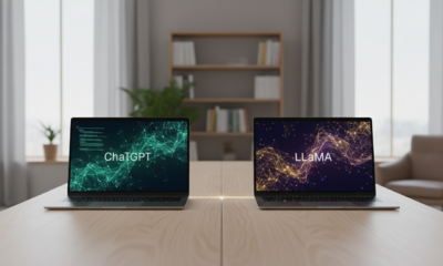

ChatGPT vs LLaMA: Which Language Model Will Dominate in 2025?
The Colossal Battle for AI Supremacy: Open Ecosystems vs. Walled Gardens In the rapidly evolving landscape of artificial intelligence, the...


Mastering initial ch words: tips and activities for early readers
Decoding the Mechanism of Initial CH Words in Early Literacy Language acquisition in early readers functions remarkably like a complex...


Howmanyofme review: discover how unique your name really is
Unlocking the secrets of your name identity with data Your name is more than just a label on a driver’s...
-

 Tech1 month ago
Your card doesn’t support this type of purchase: what it means and how to solve it
-

 Open Ai2 months ago
Mastering Your ChatGPT API Key: A Comprehensive Guide for 2025
-

 Actualités2 months ago
Ontario Man Claims ChatGPT Prompted Psychosis During ‘World-Saving’ Quest
-

 Tools2 months ago
How to download and use open subtitles for movies and TV in 2025
-

 Ai models2 months ago
vietnamese models in 2025: new faces and rising stars to watch
-

 Actualités2 months ago
Unlock the Power of ChatGPT Group Chat for Free: A Step-by-Step Guide to Getting Started